Soon, you’ll be set to raise well-mannered modals of your very own!
What is a Modal?
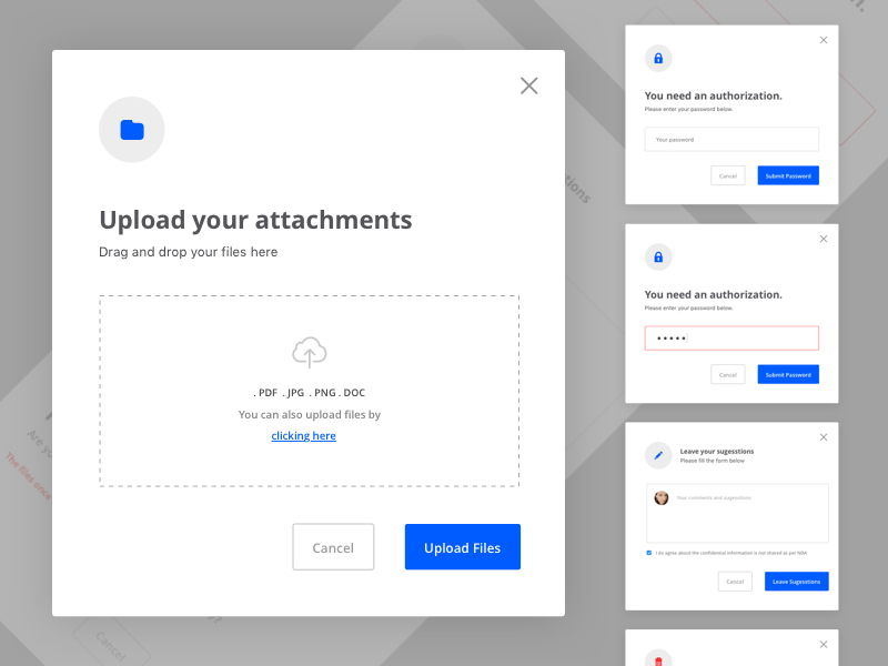
Overlays, dialogs, pop ups, alerts, light boxes… The much maligned Modal comes by many names, but its properties are generally consistent, irrespective of what one calls it. In short, a modal is a child window within the viewport of an application, that prevents interaction with the other elements on screen until resolving whatever is contained in the modal. Seems inoffensive enough, right?
Well, modals are great until you’ve been attacked by a newsletter popup within three seconds of reaching a site. Or until you’re half-way through a setup wizard only to realize you need some information from the main window and going back will lose all your content. Or perhaps, you’ve found yourself redirected from one modal to another modal - without any clear indication of their relationship.
All of the above examples (and countless more), while valid modals, are wrong. They’re valid insofar as they meet the definition of a modal. But they’re wrong in that they’re quintessentially poor applications of a modal. How so you ask? They disregard the actual purpose of the user’s interaction with the page, make assumptions about the user’s knowledge, or worse exploit the user’s frustration for profit.
So modals are a menace… right? Well, hostile ones are.
The Well Mannered Modal
Well-mannered modals can make excellent additions to your site or application. With a firm upbringing, some delicate hand-wringing, and this five point listicle - you’ll be set to raise well-mannered modals of your own.
-
User initiated. The well mannered-modal sits around patiently - not grumbling or itching to popup, just quietly waiting for a user to call upon it. A link click, button press or selection is an appropriate trigger for a modal. The elapsing of 3 seconds after landing on a page isn’t. Respect the user’s actions.
-
Never interrupt, save for murder. This ties in neatly with our last point. Interruptions are bad unless they’re absolutely critical to the user’s current task. Warning the user they’re about to wipe their account, is probably a worthwhile interruption. Bullying the user into signing up for a newsletter prior to them even having finished an article, certainly isn’t. Avoid interrupting your users for non-critical stuff because it’ll distract and drive them away from whatever value you’re providing them.
-
Keep it shallow, stupid. Modals are terrific for brief, self-contained dialogues with the user. For instance, a user clicks on a button, a modal pops up, and prompts them for some form information, before promptly closing upon being saved. If the process is shallow and self contained, like in this example, then a modal is appropriate. If in order to complete the aforementioned form, the user needs any information from prior or adjacent screens not contained within the modal, then you’d be better of using a regular non-modal screen.
-
It’s not a trap! You need an emergency exit - reliably. Every modal should allow the user to return to the modal-less page without any change in it’s state. This could be a cancel button or perhaps an ‘X’ on the top right of the modal - but you’d best avoid being creative. Treat it like a fire escape - it’s only effective if its glaring and obvious, so you know where to go in case of emergency.
-
Full focus required. A modal forces the user to focus on an immediate screen before allowing them to return to the original page. In light of this, you’ll want to avoid relying on modals if the user needs to pay attention to other things on the page.
And that about wraps it in terms of the fundamentals of well designed modals. If design and development interests you, we’ll be exploring other UI best practices and conventions in later articles, so be sure to sign up for new essays below.

Never miss an essay!
If you find software development, design, systems thinking and management interesting - just drop your email into the box below. We write content roughly every other week, we won't share your mail with anyone, and we certainly won't spam you.
...and you're done! Thank you so much!
Contact us today!